So the Tuesday of this week marked the final game production hand in of the first year. I sort of feel really happy about this because I've managed to achieve so much in the 7 ish months I've been here at DMU and I feel really sad that the first year has almost come to an end!
Anyway, for the past 5 weeks I've been creating my gladiator for the last project.
For this project, the aim was to model and texture a
Roman Gladiator based on reference and our own concepts. I first had to collect
a variety of reference images of types of different Gladiators in the build-up
to my final design. This was anything from anatomy references on the K: drive
to making boards on Pinterest including various different armour types etc.
As we’re working on a low poly model, the main body of
the Gladiator had to be under 2500 triangles with an extra 300 triangles for
any armour. As we also have to rig the character, we had a budget of no more
than 28 bones in the biped. For the main body, we had a 1024 x 1024 24 bit
diffuse texture, a 1024 x 1024 24 bit normal map and a 1024 x 1024 24 bit
specular map. The armour had to use a 512 x 512 24 bit diffuse texture, a 512 x
512 24 bit normal map and a 512 x 512 24 bit specular map. We were also given
the option to use alpha maps if need be.
Collecting Reference Images:
During my research process, I collected a range of
relevant images that would help me with the building process. This involved
creating mood boards, creating quick concepts of various armour types from said
mood boards, and choosing a final concept ready to build in 3DS Max. I also had
to source reference material from the K: drive for the characters anatomy.
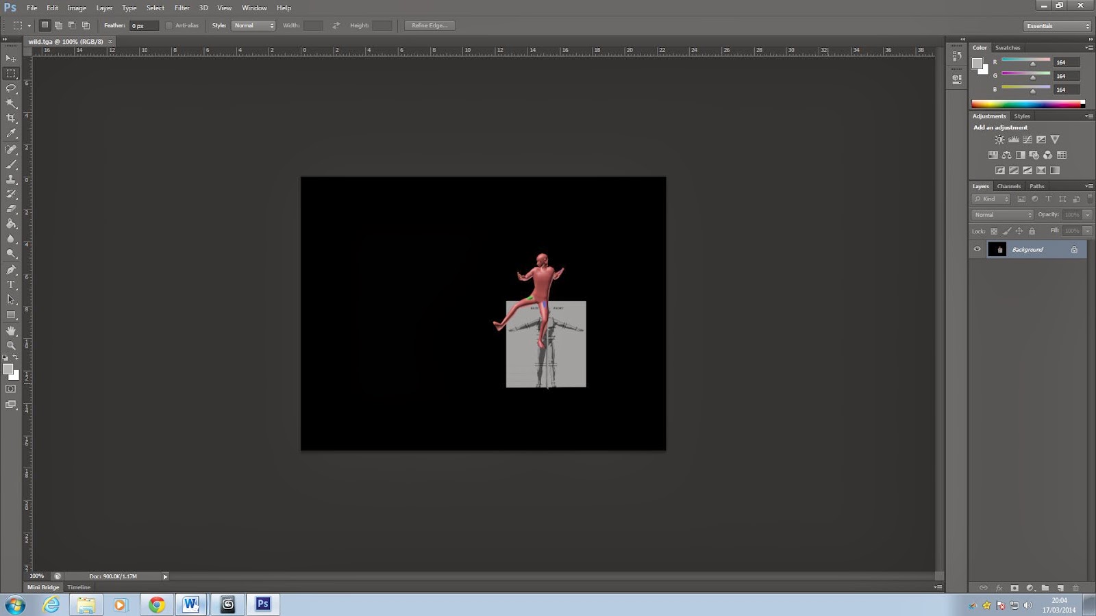
Above is one of the basic references I used for building
the base mesh. I found this image to be particularly useful as it pointed out
the specific areas of the joints and where the edge loops need to be.
Building the Mesh:
Yay, onto the fun stuff! This part of the design process
is always enjoyable as it’s where you really get to define what your
character/object is going to look like.
I first started by setting my reference planes up – as
shown above – and box modelled the torso and basically built everything up from
there. I did a couple of practice ones to familiarise myself with the process
and see which method worked best for me.
I found box modelling (shown above) really easy for the
body but rather challenging for the head. Instead, I chose to model the head
using edge loop/strip modelling. This took a little longer and I made a LOT of
mistakes which meant I had to start again. This didn’t bother me at all because
I learnt from the mistakes I’d made and managed to avoid them in later models.
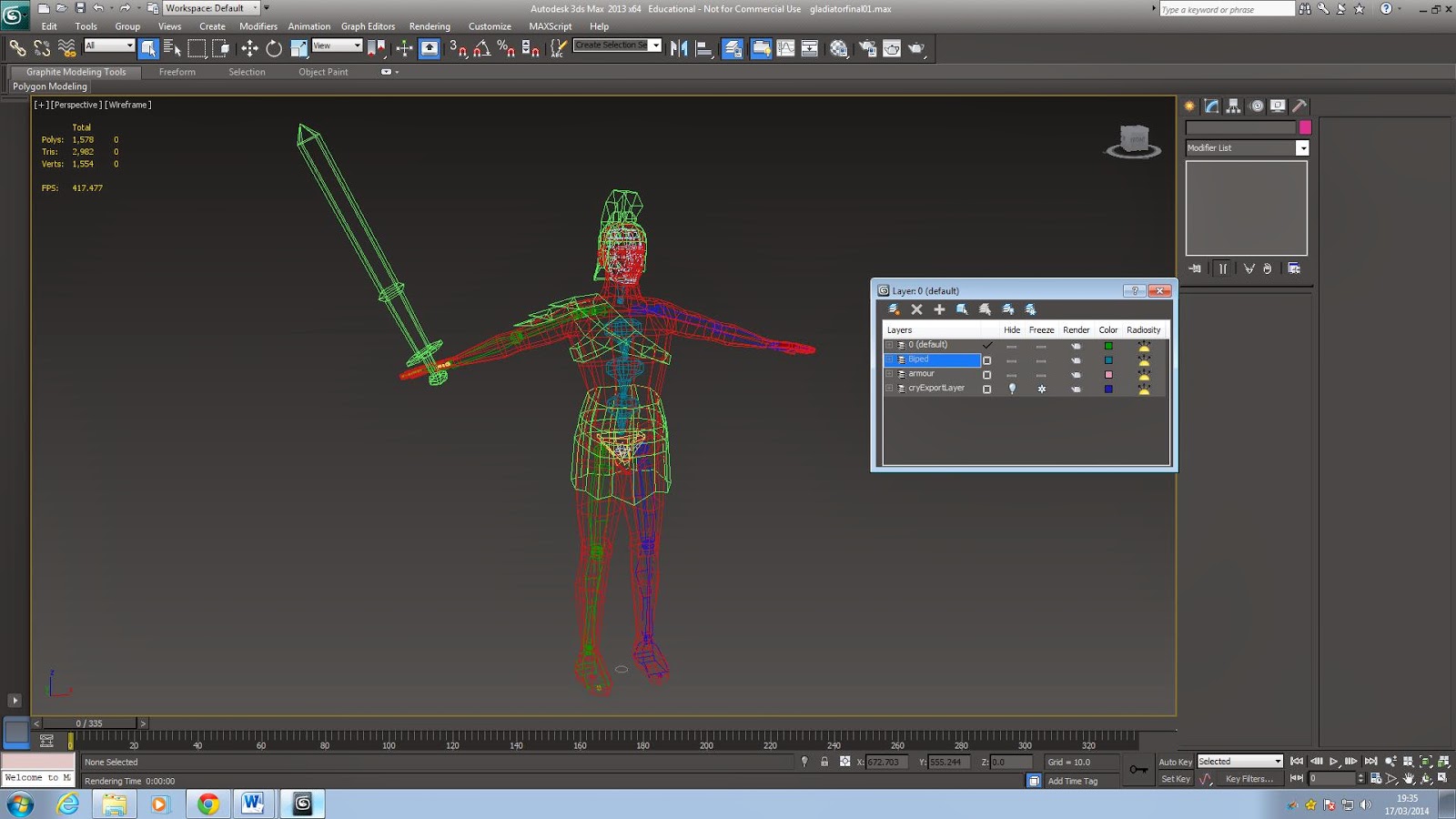
The above images are wireframe shots of the box modelling of the body and the
edge loop modelling of the head. After modelling the torso, I deleted half of
it and put a symmetry modifier on to ensure both sides were exactly the same.
This was simple enough to do, but also a huge pain if the pivot wasn’t bang in
the middle of the object. I also did the same for the head.
After the base mesh was all built and attached together,
I then went on to model the armour. Using my final concept and various
reference images, the below wireframe shows the armour I went for. I chose to take
a more traditional approach, because let’s face it, those hairy helmets are
pretty damn awesome. When building the armour, I was advised to match the mesh
density of my model rather than stick to the restraint given in the brief. This
meant my total tri count for the armour came to 520.
Rigging &
Animating:
This is the
part where I had a huge breakdown and cried because rigging just hates me. As
soon as those bones are added and the envelopes are edited, everything is a
huge no from then on. As stated in my introduction, we had a budget of 28 bones
which is a fair amount for basic animation so this didn’t bother me at all. The
rigging however did bother me. At first I thought ‘ooooo all the pretty
colours, this is going to be fun’ little
did I know just how wrong I was. I think I rigged my character about 5 times
because everything was going wrong and my armour just didn’t want to move along
with the biped. I soon realised I hadn’t put a skin modifier on the
armour…problem solved. I also encountered a number of problems where if one of
the legs was moved, the knee of the other leg would move along with it. Cool
stuff. However, once I’d got the hang of vert weights and capsules, everything
started to make sense and fall into place. In the end I did really enjoy the
rigging process. Especially when I got to animate it to make sure there was no
deformation.
UV Unwrapping:
For some reason I seem to really enjoy unwrapping, so
after the stress of rigging, this stage was a breeze. I started by deleting
half of my model and using the ‘point-to-point seams’ tool in the UV editor to
define where I wanted the seams to be ready for the pelt mapping. I also had to
hide the seams so they wouldn’t be as obvious on the model, for example; the
inside of the legs and underside of the arm. The hardest part of this was
definitely unwrapping the face, it was just trial and error on where to put the
seams and whether or not the texture would stretch due to the placement. I
found that putting a seam smack bang down the middle was a good idea, however
this worked and the head seemed to unwrap perfectly. Once I’d pelted and
relaxed the model, I then collapsed everything down and put the symmetry
modifier back on. After messing around for a bit I added another UV modifier
and due to the symmetry, all of the elements were overlaid on top of one
another. I left the legs and arms overlapped as I wanted the same texture on
these, however for the head, torso and back I chose to pelt and relax these
again to make texturing easier.
*Cue big problems*
I had to unwrap the head approximately 9 times as
whatever method I tried, serious stretching would occur and often the eyes
would go off in a total different direction. The method I found that worked
best for me was to detach the two faces, and have them nose to nose with one
another. I then chose once edge – on the tip of the nose – and stitched these
together making sure nothing overlapped. I then did the same process for the
brow line and eventually stitched the whole face together. I then had to select
all of the verts in this centre line and align them vertically. Finally I
relaxed the faces and repositioned a few verts so that the texture wasn’t
appearing as stretched on the model.
Texturing:
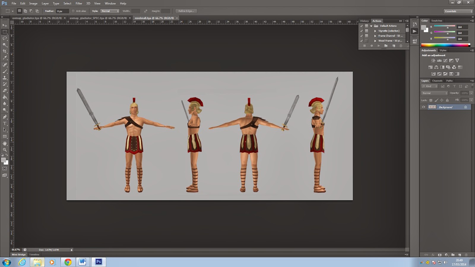
After I’d
completed the unwrapping process, I started my texturing. I decided to hand
paint these as I really enjoyed doing it for the Transit Van.
This is the texture sheet I’d
created for the armour. After collecting various images of Roman Gladiators, I
went with the ‘traditional’ colours. As before, due to this texture sheet being
512 x 512, I chose to work at 1024 x 1024 to increase the detail and used
bicubic sharper when reducing the size.
I also hand painted the texture sheet for the skin of the
gladiator too. To save triangles, I chose to paint the sandals onto the
texture. When creating this texture, I used some reference images to help me
decide where to place the shadows and highlights on the body. I found hand
painting textures much easier than using photographs as it’s much more simple
to get rid of seams.
Evaluation:
Overall I really enjoyed this project and I’m rather
happy with the final outcome too. I’d definitely like to re-do the rigging if
I’d had the time as it’s not brilliant but I’d managed to fix the worst of the
deformed areas which is always a good start! I also learnt from doing the
Transit Van project and this time my total tri count came to 2462 - much closer
to the 2500 budget! I’m also really happy with my textures, there are still a
few seams there but they’re hidden by the armour so thankfully they’re not too
obvious. I also managed my time much better on this project and set myself a
week by week timetable of what needed to be done. This meant I also had time
left over to fix things up and add specular and normal maps – again improving
from the Transit Van…
So now the gladiator project has been submitted, for the rest of the day we had a basic introduction to UDK. In a way, I'm happy that I've been shown the basics as it means I'll be able to practice over the summer in preparation for next year. However, I've only just got to grips with 3DS Max so the thought of using a new piece of software is slightly daunting.
During this lesson we imported a barrel into UDK and textured it using the content browser. I actually enjoyed this waaaaaay more than I thought I would, and after a few tries I feel confident enough to experiment with importing scenes I've made in Max from previous projects. YAY FOR BARRELS.


