WE MADE IT. Friday 30th marked the deadline for this project and we actually managed to achieve almost everything we set out to do! Woo! Here's a few screenshots of how it's looking at the moment...
Monday and Tuesday were spent polishing the level and fixing up assets and textures to ensure everything was running smoothly in UE4. Monday was also the day all of us hit a brick wall and found it extremely difficult to finish any work whatsoever. I think the late nights and early mornings were really starting to burn us out.
We also went to the VFX Festival in London on Wednesday which set us back a bit as we had to set off at 5am but oh my lord was it worth it. 10/10 would recommend going. However, on Thursday we stayed in the labs until close again in order to get the final detail pass completed. I got all of my mushrooms placed in the storage room and the corridors which meant we were finally able to tilt the level. This caused a hell of a lot more issues than we thought. The main one being the floor fog. Oops. For some reason, it's not blending well at all with the floor or the crates anymore and we keep getting really harsh lines. Why do things like this always happen at the last minute?
Blending sucks.
On Friday we spent the whole day adding the finishing touches and panicking over decals. Amber and I spent ages trying to get them to work and look good, but this was proving incredibly difficult due to the angle of the rooms. ARGHHHHHH. We managed to get a few working, but they weren't able to be copied over to other sections due to the different rotations of corridors. Just as one problem is solved, another occurs. We've now got some weird issues with indirect lighting cause an odd orange mist. Brilliant.
Well, to end the post on a more positive note, we had a pretty awesome guest lecture on Friday morning! We had two former DMU students - Del Walker and Ben Keeling who now work at Sony - come in to speak to us about the work they produced at university, the work they're producing now and how they got to where they are. They also made an extremely good point of not staying up until ridiculous hours working on projects...which is pretty much what we've done on this project...but it does look awesome so it was worth it.
So it's super weird not having any deadlines to work to or anything and I'm not sure I like it. Sure, it's only been a couple of months since summer, but it already feels...alien? Argh.
I'm staying at uni until tomorrow so I've managed to get a hell of a lot of drawing and painting done without being pestered. I had a dream last night about a desert and I've also been playing Uncharted 3 again so..............I painted some deserts. Aww yiss.
I've been trying to work quicker over the past few weeks, so I allowed myself an hour and a half for each piece, which seemed reasonable. At the time. They probably took closer to two hours because of the damn sand. The ripples in sand are horrendous to paint. Nope.
I found out at the end of last week (or the beginning of this week) that we'd been given an extension on the project. Instead of it being due in for the 5th, it's now got to be completely finished by the 10th in preparation for presentations on Thursday. HALLELUJAH. For once, I actually feel like I'm ahead of myself!
Sooooo, the modelling and unwrapping stages are complete! I've spent the majority of this week hand-painting my textures and making sure they all look pretty in UE4. I did attempt to sculpt folds into the skirt, which took me around 10-15 minutes, however 3DS Max decided it didn't want to bake anything. So a height map it is. Me being me, I left the normal until last for the first time, and I reeeeaaaally regret this now. Partly because of this.
Why is this happening at the last minute? :-(
I'm not sure how I didn't realise this was going to happen if I'm being honest. Idiot. I'm kicking myself over this now, but considering I've got 3 days left and it doesn't affect the model in UE4, I'm trying not to let it bother me too much.
UE4 is currently updating so here's a little Max render of how the textures are looking so far! I'm planning on adding a hell of a lot more detail into the skirt & other areas - hence why it isn't shown - but I'm starting to feel a little happier about her now.
I also managed to get hardly any work done on Saturday because I've been so distracted by the Uncharted 4 gameplay video. Help me. This also meant I stayed up until some ridiculous time in the morning playing Uncharted...
However, I managed to get all of my textures completed on Sunday which can only mean one thing...let the rigging begin.
So the film project has come to an end, and the start of a new 'sentry' begins. Ha. I'm also super sorry that is post is like, 3/4 days late. Halloween took over.
Moodboard 1
More detailed moodboard. Yay.
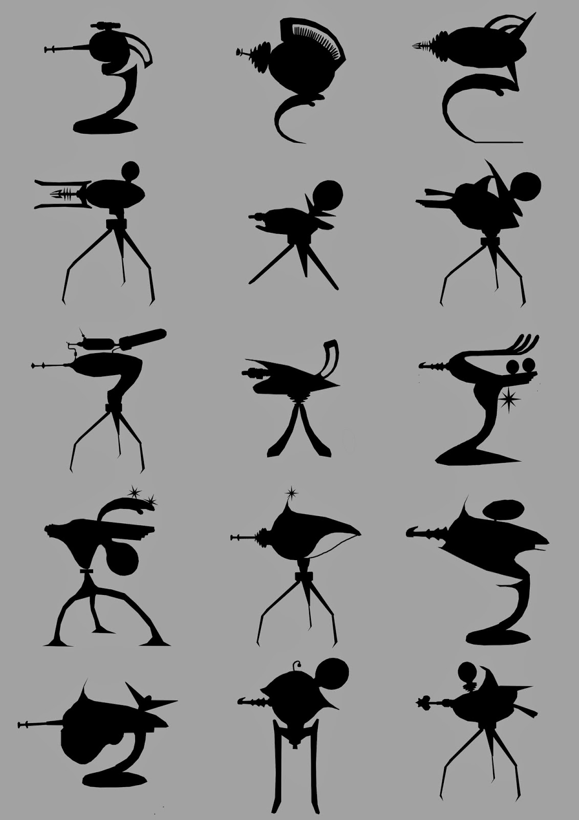
The project was announced on Monday and we've got to design/model/animate a sentry gun - sounds awesome already! Due to finishing the film project on Thursday, I started making a board on Pinterest full of weird and wonderful things to help me with concepts. These ranged from Art Deco appliances & ray guns, to poker chips & neon lights. I managed to sneak a few Cacti in there too. From the images I'd found on Pinterest, I started creating a mini bash kit. I lassoed all of the shapes I found interesting and blocked them out using flat colours and quite literally bashed them together in interesting compositions. Here's the bash kit I produced:
And here's the guns I managed to get out of it:
Due to the shapes I've got in the kit, they all seem like retro 'War of the Worlds' meets super tacky. So basically what I was trying to achieve...I then had the task of choosing which ones to iterate on, which wasn't too hard as I wasn't keen on the majority of them. I found myself quite stuck on the iteration stage though because I already quite liked the designs I had so this was a bit arghhhhh. Therefore they all look a bit similar, welp.
I gathered opinions from my classmates on which idea to take into 3DS Max and got stuck into modelling ASAP. The mock-up took me about an hour, but it was extremely useful to produce clown/AO renders from to paint over and also to experiment with how the pivots will work in UE4.
I did a couple of quick paint overs (as shown below) and tried to settle on a final theme. I decided to go with the War of the Worlds/Vegas casino idea that shoots poker chips. Woo. This also led to a hell of a lot of research into emissive maps so I know I'm not going to fall into the trap of having no idea what I'm doing. I hope.
Anyway, here's the final concept. I'm quite excited about where this is going as we've been given so much freedom which is pretty awesome! The emissive side of things is worrying me as I want to try and animate the lights, but at the moment that's only a stretch goal so I'm trying not to fuss over it too much.
Final design WIP
Enough about guns, the rest of the week consisted of spontaneous presentations and super cool - cool shit Wednesday's. One of the current third years came in to talk to us about the BMW internship he's currently doing. Thursday we had an unexpected presentation in which we had to present the post mortems we wrote...soooo, um. Presentations aren't fun. Unfortunately there wasn't enough time in the allocated session for us all to present, so it was somewhat relieving but also sad at the same time cause I would've liked to have seen the various issues people encountered along the way.
So following on from my Fight Club post, the presentation has been...presented I guess?
As I struggled with what topic to talk about - so many films, games and artists to choose from - I decided to base my presentation on Cristina Troufa.
I spent a couple of hours nosing around on Pinterest when I saw one of her pieces. The particular piece I came across was 'Pregnant' and looked vaguely familiar from my college days!
I've chosen to create a presentation on Troufa because I think her work is absolutely incredible! She's relying on negative space to really give the detailed areas of her paintings that extra bit of wow factor.
These are the slides I used in my presentation - minus the notes...
I actually really enjoyed doing this, as nervous as I was, it was nice to do something out of my comfort zone for a change. Besides the fact I choked on my chewing gum half way through I feel it went OK...I can live in hope.
In the previous critical studies seminar, us first years were set with the horrifying task of creating a presentation on art direction, based on a topic of our choice. This could be anything from a couple of film stills to a painting. (Still a daunting task whatever the subject matter is!) I thought I could use my blog as an opportunity to just have a little play around with analysing colour and mood. For this, I've chosen to do a colour analysis of my favourite film, Fight Club. Breaking a couple of rules here but here goes...
I managed to find these really awesome stills from various different scenes in the film showing the variety of different tones included.
The above image is taken from the first scene of the film, I don't really want to spoil it for anyone reading so I'll try and get straight to the point. The majority of the movie has a very atmospheric choice of colours, consisting of mainly deep blues and greens which are obviously classed as cold colours - extreeeeemely relevant to the main plot of the film. The deep colours used within this film also help to create quite a menacing atmosphere. For example, the image below with the Narrator and Marla in the kitchen seems rather grungy. This would probably be down to the array of deep greens, greys and yellows helping to make the room seem dirty and unkempt. The sort of thing you'd expect from the old house at the end of a street that no one wants to go near because a creepy old woman lives there with 50 something cats scratching at the curtains every time someone walks by. Pretty awesome what a wee bit of lighting can do.
Again, we go back to the green tones. This time, we're in the Narrators office. Sticking with the dismal atmospheric colour palette, almost everything in the background is a mint green tone. This easily contrasts against the deeper tones of the wall, and more importantly, the crisp white shirt worn by the Narrator. The contrast between the shirt and background also draws attention to the character. Might also be good to mention that his boss also wears Cornflour Blue ties, again coinciding with the choice of colours. It also almost seems as though you're in the scene yourself, due to the depth of field. The camera is focused on the narrator, whilst his boss is slightly out of focus, again drawing your attention to the main character.
About 1/2 way into the film, this scene occurs. Yet again we can see the same green colour palette, this time the artificial lighting is making the place look grubby. You've even got the dodgy brown walls and ceiling pipes to add to the authenticity of the run-down, cheap motel look. Marla is also wearing similar coloured clothing, sticking to the colour theme of green. Whereas Tyler is very vibrant with the choice of clothing - contrasting well against Marla and the background tones. In my opinion, if the corridor was completely empty, it would seem like a scene in a horror game/film, probably an area you wouldn't really want to go near, but it intrigues you to find out what's at the end of it. Therefore I get a kind of creepy vibe radiating from this scene in particular.
Above is another colour palette from a much later scene in the film. This time we're shown a much brighter range of tones that seem to emit more warmth than those previous. I love how the right and left halves of this image are complete opposites in tonal and atmospherical qualities. For example, the left hand side of the image contains a variety of warmer tones, the most prominent being the yellow ochre. Whereas the right hand side seems much colder, washed out colours could possibly indicate dust in the air being captured by the sunlight. This again reflects on the points I made when talking about the kitchen - making the house seem grubby. (Peeling wallpaper!)
This video is probably the best representation of the limited colour palette used in Fight Club. However, by using these specific tones, it's helped to build one hell of an atmosphere. Every aspect of this film is beautiful, so you should probably stop reading this post and go and watch it for yourself...
Hey guys! I'm Lucy and I'm a third year studying Game Art Design at De Montfort University. This blog is a reflection of my time here at DMU and will be showcasing all of the awesome projects we're doing!