Thursday, 20 August 2015

So it's been a few months since my last post (oops), I am still alive though I can assure you. Well, sort of.

I've spent the past few months thinking of ideas for my FMP, however the thought of working on a project I've set myself for 3 months is absolutely terrifying me. What if I start to hate it half way through? I'm still not sure on what I want to do - character/environment wise anyway - I may do a mixture of the two, who knows.

I have been working on some personal stuff though, it's so nice being able to do work for myself again! I've started modelling/sculpting the Phurba dagger from Uncharted 2 and I'm planning on teaching myself substance painter when it comes to the texturing side of things.
I've also been involved in a summer project that a few people in first year set up. Dinosaurs yay! I decided to go with an armoured raptor of sorts, but after watching Alien for the millionth time, I decided to create a mixture of the Alien Queen and the velociraptor.


I finished modelling within a few days and I've began sculpting in the basic muscle structure. Here's how he's looking so far.


I'm kinda happy with how he's looking so far. Obviously I've still got a long way to go, but I feel like I'm finally starting to get the hang of ZBrush. I've been following an absolutely incredible tutorial by Jay Howse - he's awesome.

Muscle Pass
Final Detail Pass
I've also Polypainted him too, I tried to push myself as much as I could on this project as I'm not comfortable with creating models directly in ZBrush, I tend to create a base mesh in Max first.


Art Dump
02:50
Art Dump

Thursday, 14 May 2015

It's safe to say that this post will probably be extremely long. Brace yourselves. The rant is coming.

I'm not actually sure where to start. I absolutely hated this project. I've found that over 3 months of doing exactly the same thing isn't for me - which I guess means I'll definitely be better off in a smaller studio! We had a strong idea that wasn't executed well, which made me miserable. In essence, the last term was spent being super miserable. But, that's life I guess. You'll get stuff thrown at you that you don't really want to do, but you've gotta man up and get on with it anyway.


Throughout the course of this project, working within a team of 6, we were required to make a functioning game level based upon Alice’s Adventures in Wonderland. The three topics we could choose from were: Oxford, gardens or underground. As a group, we decided to go with the underground theme as this appealed to all of us and seemed like some interesting work could be produced from it. 
A week or so before the project started, we all had to fill in a sheet and specify the roles we felt most comfortable in. This was to ensure there was an even split of people within teams. However, in our group, we ended up with 3 character artists and 3 environment artists but we worked around it and all chipped in on other areas - such an engine work. 
As we had 3 character artists within the group, we had to decide quite early on who was going to be modelling who. I was given the White Rabbit to model which I was both excited and nervous about as I’ve not modelled anything non-humanoid before.
However, as I managed to get him finished much sooner than what I'd initially planned, I took on a few extra assets and roles in order to lighten the load on my other team members. We needed a lot of assets to populate the level as it's so large, so I made a variety of picture frames, candles, lanterns, pocket watches etc. I was also in charge of modelling the skirting board, wooden panelling on the walls and the coving.


In addition to the character and extra assets, I also contributed to other areas of the project, for example:
  • Concepts: Moodboards for the characters, style guide, book, warped assets & rabbit clothing. Concepts for the rabbit, final door and a storyboard.
  • 3D Models: White Rabbit (Modelling, unwrapping, texturing, rigging, skinning and animation in Max & UE4.) 4 picture frame variations, candles, lantern, pocket watch, skirting board, wooden panelling (thick & thin variants), wrought iron door and the chest.
  • Sculpts: 3 beam variations, candles, 3 frame variations.
  • Unwraps: Steps, columns, lobby decor, stair supports, railings, ceiling supports, raised platforms, beams, chest and both sets of moveable stairs.
  • Light Maps: Chest, 6 bookcase variations, camera, ceiling light, chandelier, desk, fireplace, cutlery, key, pen, plates, rose, wall light, furniture, desk lamp, rose vase, book, chest, final door and both sets of moveable stairs.
  • Textures: Clean tile set, dirty tile set (for vertex painting in engine), 4 light masks, flip book texture for the candle flame, rabbits fur, rabbits body, pocket watch and normals for all of the frames.
  • UE4 Materials: Rabbits body, rabbits fur, rabbits clothing, gold, glass, pocket watch, candle flame, subsurface for candle, frames, beams, desk, frosted glass, Alice's clothing, Alice's hair (subsurface), Alice's skin (subsurface) and the chest.
I also helped out with the population and lighting within the study area of the level and the population of puzzle area 3. The general level itself was populated by everyone in the group. 

Mystical floating candles..woops
I felt far too stressed out for the whole of this project, I'm not really sure why, but this was definitely the cause of my 'lack of enjoyment'. We just seemed to have one issue after another, which led to James and I staying up until 3am towards the end of the last week fixing things that should've been done weeks ago. For example, our playable character is Alice. Guess when she was put into engine. Yep, Thursday evening. A few working hours before the deadline. James had been asking for the assets for weeks, but it just didn't happen. However, I managed to get her working correctly with the default UE4 animations and replaced the blue dude in the third person blueprint. It was actually quite fun retargeting bones.


Whilst working on this project, we often had people telling us that it was looking really cool - but it was such a huge level. We found out that one of the judges is big on architectural accuracy and luckily for us, we had Jack helping us. He helped James out a lot with the overall structure of the lobby - especially the stairs and surrounding supports. The lobby is definitely the best looking area in the game, it still needs a lot of work, but we're developing an action plan of what needs to be done over the next 6 weeks to make it look fabulous. As well as receiving feedback from Jack, we also had weekly meetings with Steve and Chris to ensure we were on track.


Overall, I'd say our communication (or lack of it) let us down. Communication is such a vital thing in a project as big as this, and although we had a lot of it, it obviously wasn't enough. A lot of the time, it was unclear what people were working on throughout the day and the asset list I created on Google Drive wasn't being updated by certain members so we were unsure what stage people were at. This was a pain when people weren't in labs, or working on different floors etc. We worked around this though, and tried to play it to our advantages. Regular team meetings were - and still are - essential.


After receiving feedback around two weeks or so before the deadline, we realised that we really needed to cut down our level. What we had was underpopulated and it was suggested to us by our lecturers that we cut out the less important areas, and focus on making the remaining ones look really polished. This was something we'd been discussing for a while, but it always helps to get definitive feedback from others. After receiving this feedback, we decided to cut the following areas:

  • Initial study area - being cut down into just the desk.
  • Room in which you fall into from the rabbit hole.
  • Corridor following said room.
  • Puzzle area one is being cut down into one room instead of two. 
Looking back, I'm glad we had to cut these areas. At its current state, our level isn't completely polished. I dread to think what it'd look like if we hadn't cut it down...


If we were to start this project again, I'd definitely make a strict time plan and make sure we had a definite team leader in place. Our main issues seemed to be time management and communication which ultimately led to our project being a little more unfinished than what we wanted. I feel that if we followed our time plan more closely, and had daily team meetings, we could've reached all of the goals we set out to do. The three-ish random team meetings we seemed to have each week didn't seem to suffice.


Overall, I feel this project could have gone slightly better. We were way too ambitious with what we wanted to achieve and didn’t organise our time as well as we should have. I’m happy with the final outcome, but there’s so much more that could’ve been done. In a way, I feel disappointed. We all worked well as a team, but there was no real team leader to ensure that things were being done by certain dates – we were all relying on each other to have stuff done by agreed dates, which often worked but most of the time, it wasn’t as successful.


I’m happy with how I managed my own time though. I managed to get the rabbit finished (textured, rigged & animated) before the Easter holidays. I allowed myself time to improve on the rig and refine the animations after he’d been tested out in engine which meant I wasn’t panicking about not having him in the final level a few days before the hand-in. This also meant I had extra time to help people out with their work. For example, I spent the majority of the last two weeks doing the light maps and collisions as they hadn’t been done along the way.
I also spent the last part of the week fixing up silly mistakes. Files had been named wrong which led to confusion when importing, the scale of certain objects were all over the shop and pivots were in the totally wrong place. These were easy fixes though, and I'd rather they were fixed than left to cause more issues.
Ideally, I would’ve liked to have spent the last week polishing up my own assets and maybe making a few more to help populate the level but fixing up the assets we already have is obviously much more important.


However looking back, I’d say this is definitely the one project I’ve learnt the most on. Not only artistically and technically, but I’ve also learnt more about myself too. I’ve achieved what I wanted to and even did a bit on the side too, but even though I produced a main character for the level, I don’t feel as if I’ve done a horrific amount. The majority of my time has been spent fixing things for other people, which sadly, has meant some of my own work is slightly lacking. I've still learnt from these fixes though, which I'm extremely grateful for. It's nice knowing you've helped someone in your team out too. Yay.

In order to reach the deadline set for Off The Map, we'll need to put the stricter time plan into action. I went into the labs on Tuesday to figure out what extra assets need modelling and when it all needs to be done by. We've worked out that including this week, we've got 6 left. Which may sound like a lot of time, but if you include the fact that the labs are closed for the final week, it's not long at all. Welp. I've made myself a personal time plan so I can get all of these assets modelled within a week so I can get onto sculpting pretty things and Tom has also been super awesome and made one for the group. It's a week by week one and gives us a nice idea of what level we need to be at each day.

  • Week 1 - Planning/organisation, bug fixes with models/textures and concepts/paintovers.
  • Week 2 - Modelling of assets and concepts/paintovers.
  • Week 3 - Sculpting/Texturing/Baking and fun engine things.
  • Week 4 - Review of population and 'is it playable?'
  • Week 5 - Finalising/polishing and OTM required documentation.
  • Week 6 - Final polishing pass and packaging of the level.
The majority of the team has been in the labs this week anyway, and we've managed to get our level looking more finished! Well, here's to the end of second year. It's been a good one.


Off The Map: Post Mortem
09:54

Off The Map: Post Mortem

Friday, 24 April 2015

I'm now 99.1% done with this project. Up until now, I've been enjoying myself and the work I've been producing. However this week was just horrific. I feel as if I'm doing more things and not moving forwards at all, it's so frustrating. It doesn't help that the deadline is two weeks away and we're nowhere near finished.

We've been speculating over the last few weeks that our level should probably be cut down, however, this is now seeming like something necessary. We're unsure of what areas need cutting as of yet, as they all seem pretty vital.

My group had a presentation with some lecturers one Tuesday, and we came out rather happy with the result! They liked our level, and gave us some suggestions on what areas need to be cut. So, drum roll please...the study, the area you fall into from the rabbit hole and the first corridor are being cut! One of the puzzle areas containing two rooms is also being cut down into one. Phew. This means less work to produce, but more time to polish! Which is exactly what we need to be doing at this stage.


So, the room above is the first puzzle area - containing the anamorphic puzzle - the door on the right hand side now leads to nowhere! This is the first room that was to be cut down. Initially, you'd have to answer a riddle in order to unlock the door which would lead to an anamorphic puzzle. However now, its all been merged into one room.

One of my team members. James, has been playing around with something in engine called diffuse boost. It essentially lightens the value  of the materials before baking the lighting which means softer lighting! Although, in the last project (container city) we had this awful yellowy/purple haze going on. Which seems to have appeared again, it must be something to do with the bloom. Either way, it's going to need fixing before the hand in.


We've also encountered a few issues too. I reimported the White Rabbit early on in the week and it completely broke. Firstly, there was no animation attached to it, even though it was showing up in the editor. Secondly, the pivot was way off, even though it was centred in max and finally, when you played the level, the rabbit would flicker on and off. However, I managed to fix all of these in a short space of time after having a little cry. The flickering was due to a lighting problem in the map - I figured this out by testing it within another engine file. He works again now, and I'm a happy egg again.


Also, the essay and character resubmissions are finally done! It's almost as if a huge weight has been lifted off my shoulders. Although, it does seem a bit odd knowing that tomorrow is the *sort-of* last day at term, but we're still working on Off The Map. I'm looking forward to be able to focusing on a single project for the next 2 weeks though. Hardcore propulation!

Week 30: IT'S DONE, IT'S ALL OVER.
03:42

Week 30: IT'S DONE, IT'S ALL OVER.

Monday, 20 April 2015

So, the presentation is over and I thought I may as well post it on here to clear my head as I've been panicking I said the wrong things on the wrong slides and arghhh.


I was thinking about doing my presentation on a project we've been set this year, such as Off The Map or the Dichotomy Character, but instead, I thought I'd do it on something even more interesting and adorable. One of my favourite games -Road Not Taken!


Road Not Taken is an RPG/puzzle game created by Spry Fox, a company based in Seattle. Their goal is to make the world a happier place with the use of games! Which you can clearly see, as all their games are pretty damn adorable and Road Not Taken has definitely made me pretty happy.


Once a year, in the middle of winter, your character – the ranger – is tasked with venturing out into the woods to safely return children to their parents or the mayor. Sounds simple? It’s really not. It all seems cheerful and cute, and then you’ll come across a creature that’ll eat one of the children. So not cool.


Lead artist on RNT was also an art director on an MMO called Glitch. As you can see, the Ranger in RNT was clearly inspired by the Smuggler character in Glitch.
Main character – staff signifies a ‘lone traveller’ persona.
The hooded character allows everyone to relate to it – as at the beginning, you’re unsure of the gender.

Whimsical yet wizard- like – human in nature.


As you play through each year, you’ll realise that your character ages. Dependant on the choices you make early on in the game – for example, you’ll talk to townsfolk and they’ll ask you questions like “who do you take after? Your mother or your father?” this question defines the gender of your ranger when your hood comes off later in the game.


Also, as your character ages and you progress through the 15 year lifespan, people in the town will make comments about your age. Especially the doctor. Of course, 15 is the maximum age, you can easily die before. For example, if you’re running low on health, the red and white spirits will turn black and follow you around until you accidentally walk into one, and die. 


So, as I mentioned in a previous slide, the game starts off seeming all cute. As you progress further through the levels you start to see things taking a turn for the worst…things become much darker, and scarier creatures start appearing. If you’re not careful, you’ll get wisps and other creepy things trying to steal the children. 


Procedurally generated systems may become repetitive  over time so to solve this, the peaceful fields you’re standing in in one area may change to an icy cavern as you reach the next area. The change of terrain is a helpful progress marker and can indicate what new challenges you, as the character, are about to face.


I’m not a big one for stylisation – I think it's because I find it quite hard to reproduce myself and prefer to take a more realistic approach when designing. However this game absolutely stuns me, it’s incredibly beautiful.
- Individuality of the art style

- Paper cut out animation-esque


The developers have said that the underlying message of the game is “living the best possible life you can whilst on this Earth” but if you've played the game you'll know that it really means – work until you die. So basically an accurate representation of game art!
Week 29: Presentations
04:09

Week 29: Presentations

Sunday, 19 April 2015

It actually feels pretty good to be back in the swing of things! Minus the fact we've all got to do presentations on Friday (welp), I'm feeling pretty optimistic about this week. Which is worrying.

I've been modelling and unwrapping random assets this week so you could say its been pretty chilled out. We're all focusing on the essay, presentation and character re-submission. There's so much going on at once it actually hurts. I've almost finished my essay, which is one less thing to worry about, however I've yet to write the conclusion. I'll get there eventually. The character re-submission is going quite well too! I haven't done too much on it yet as I've been focusing on other projects, but I've started to act on the feedback given to me in the last assessment. She already looks so much better!


door_corridor.JPG


I modelled a couple of different iron variations for the door between the lobby and the first corridor, however the one above was deemed the most suitable for the level. I'd tried to keep it similar to the railings we've got on the staircase in the lobby so nothing seems too random and out of place.

HighresScreenshot00000.png

You know when you've got what looks like a lot of stuff in a Max file? Then it looks like hardly anything in engine? Yep. We're going through that right now. In the group meeting we had this week, a couple of us are swapping assets and taking more on board in order to get our level looking as awesome as possible for the deadline. I mean, it's not the end of the world if it's not 100% perfect, it's never going to be, it'll just be nice to have something to be proud of. 


On the topic of presentations, I chose to do mine on one of my favourite games, Road Not Taken! I was thinking about doing it on Uncharted, but I was a little worried about fangirling my way through the whole thing. Woo. It actually went much better than what I thought it would! I was bricking it before-hand, but the feeling after you've done it is so good, I wanted to do it again!

Week 29: Can it please just be over?
16:40

Week 29: Can it please just be over?

Sunday, 12 April 2015

So I'm surrounded by Easter eggs and life couldn't get much better right now. So much chocolate. Anyway, it's the last week of the holidays and I'm super bored now. I just want to be back at uni. I mean, I've been in the labs the majority of the time but it's just not the same.


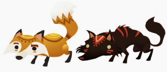
As well as writing essays, sorting out presentations and continuing with OTM, I've actually been trying to set aside an hour or two a day to do some paintings. I'm soooo happy I've done this, as I seem to feel a lot more positive about everything! God knows why. Today I've done two animal studies from the game 'Road Not Taken' - if you haven't played it, you should. Cutest game ever!

"I'm scared of her...she's like the big bad woof" 
On Thursday the 9th, I had the opportunity to go to a Q&A session with Nolan North - hosted by Sony - in London. Best. Day. Ever. The event was amazing in itself and I still feel so overwhelmed by the whole experience, but it was just SO nice to just be able to get out and explore such a big city. We also visited a few museums throughout the course the day - the Natural History Museum, The Wallace Collection and finally the Science Museum! However, we only spent around half an hour in the science due to timing. Wah. Also, being on the tube at rush hour is so not cool. 


I've got too many ideas on what I want to do my presentation on, and I can guarantee that I'll only decide around 3-4 days before *sigh*. I used to love being given free reign when it comes to choice, but this was just a big lump of no. However, I'm starting to feel a little more comfortable with my essay now too, I've finally realised what it is that I want to do with my life and what I need to do in order to achieve it. In a way, writing this essay has helped me to sort my life out. Two birds with one stone hey. 

But apart from that, my Easter has been pretty uneventful. I ate way too much chocolate and got a bit fat. That's what Easter's all about though, right?


Week 26, 27 & 28: Have I eaten too much chocolate? Probably.
16:30

Week 26, 27 & 28: Have I eaten too much chocolate? Probably.

Sunday, 22 March 2015

So it's the last week of term 2, and we've managed to get the bulk of the assets completed! Yay. Everything is finally starting to come together, and it looks pretty damn awesome.

Emma - How cute is this one!?
I finished unwrapping the rabbit mesh earlier this week and I've been texturing for the rest of it. As we're following a specific art style, we've decided to hand paint all of the textures for the characters. After receiving feedback on Tuesday, Emma suggested I look into a variety of different hand-painted methods and decide which one would work best for me. I've never enjoyed hand painting textures for some reason, but I had an absolute blast with this one! I think it might have something to do with the fact my unwrap looks slightly like Grumpy Cat...


I've been using this Dan LuVisi tutorial to help get a better understanding of fur and how to make it look slightly fluffier. I'd decided from the beginning that I wanted to use alpha planes to achieve a good level of 'fluffiness' so I just used a basic fur brush to create the initial base layer.


Ahhh 4k textures look so much nicer. I'm SO happy with how his ears turned out - I'm planning on testing out subsurface scattering on them to make him seem a little more realistic.
After placing a few more fur alphas down, he was starting to look a bit fluffier...but also quite tiled. Gahhhh. This was due to the planes being so small. So, back to the drawing board, I resized the planes, and boy, I'm glad I did. Here's how he's looking now.


I've still got quite a lot of planes left to place, but he's starting to look a little more finished now. 
Week 25: Alphas are wonderful things.
05:55

Week 25: Alphas are wonderful things.

Tuesday, 17 March 2015

Following on from the recent assessment, I've been advised to make an action plan for the next stage. This will help me decide which areas of my work need to be improved and how I can improve them. The two projects marked at this stage were the container city and the dichotomy character so I'll mainly be creating this plan based on the feedback I received on these specific projects.

Technical Aspects to improve on:


  • Seam placement – For the dichotomy character project, I’d unwrapped her pretty badly, and decided to put a seam straight down the middle of her forehead. This meant that the normal maps were shading horribly in both 3DS Max and engine and was something that could’ve easily been avoided. 
  • To improve - I plan on resubmitting the character project at a later stage, so this will give me the chance to fix up all the awkwardly placed seams. The main one I'll need to correct is the seam placed down the middle of the forehead.

So gross.
  • Texturing – Texturing is possibly one of my weakest points, and is something I’d definitely like to improve on in the near future. The textures on the dichotomy character looked a bit too flat and there was no real material definition.
  • To improve - In order to achieve this, I've been advised to look at different methods of how other people produce hand painted textures etc. and follow a similar workflow. I’m also planning on looking into colour zones to make my textures a little more interesting and less flat.
Stick leg.
  • Anatomy - Emma pointed out that some areas of the model were too 'straight'. For example, the calves looked way too flat, no curves were included to suggest muscles. 
  • To improve - I mentioned earlier that I was planning on redoing the character, this means I'll be able to fix all of these issues and look into the flow of topology around joints to ensure she deforms correctly.
Action Plan for the Next Stage
06:02

Action Plan for the Next Stage

Sunday, 15 March 2015

So this week has been pretty fun. Last week I was modeling clothes, frames, architrave and sculpting candles. This week I was finalising the clothing, sculpting detail into it and rigging. 


I managed to get this all finished pretty early on in the week, to allow myself more time on the rigging process. Before I started the rigging, I had a brainwave and realised that I should probably be doing the animation first, so I'm not wasting time moving bones forwards and backwards. Possibly one of the most time-saving ideas I've had throughout the duration of this project. I'm an idiot. 

Using the above chart, I created a short animation which I enjoyed a hell of a lot more than what I thought I would! The only thing that's really irritating me is the horrific jolt at the end...ughhhhh. I've been playing around with timing and placement of keys to try and fix it - trust me, it's not nearly as bad as it was. But, it's getting there, which is the main thing. 


I spent the majority of the weekend rigging, and he's finally done! For some obscure reason, I actually find rigging quite therapeutic...weird. Needless to say, time flew by anyway.
Week 24: Animation
08:14

Week 24: Animation